
Whether a brand decides to tweak its logo or overhaul its entire look, rebranding is a major decision for any company.
According to the Looka blog, 2023 has seen a flurry of major rebrands, many of which are opting for energetic colors like bright green and neon yellow. Others, meanwhile, are still betting on minimalism, with geometric and art deco designs breaking through as popular picks.
Take a look at some of the best design rebrands of 2023. Which do you like? Which don’t you like and why? Review each redesign and draw inspiration for your own brand.
Pepsi
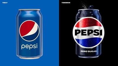
With the autumn season comes changes in the colors of leaves, as well as iconic brands. This fall Pepsi is rolling out new branding in North America. This is the first time in 14 years that the beverage giant will change its logo, giving its cans, bottles, delivery trucks and overall digital presence a makeover. Touch ups include a new custom typeface, a color palette that includes a deeper electric blue and black, as well as an entirely new can silhouette. The redesign’s goal was to give the 125-year-old brand a contemporary edge. What is your brand’s goal?
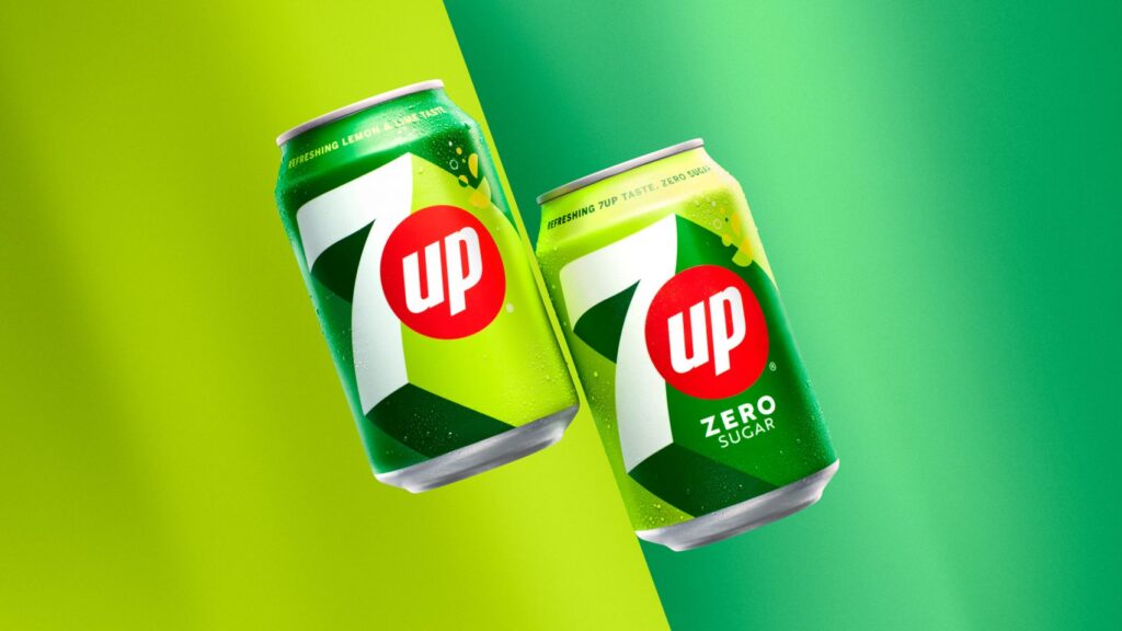
7UP
7Up saw its first rebrand in seven years. Also owned by PepsiCo, the lemony-lime beverage can is now in simpler packaging, with lighter design elements that align with a minimalism theme. The 3D design and high-contrast colors reflect the brand’s uplifting brand messaging.
Chips Ahoy!
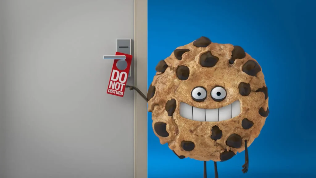
Some rebrands are accompanied by sweet campaigns. Chips Ahoy! is celebrating its 60th birthday by reviving its nostalgic mascot, Chip. As part of its brand refresh, it’s also aiming to appeal to Gen Z through partnerships and events, including a three-day themed yacht party.
Kraft Singles
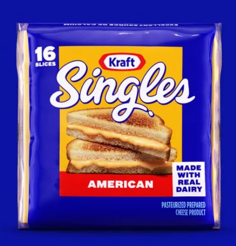
Kraft Singles took a slice out of the rebranding playbook by not just unveiling new colors, but new packaging as well. The new Kraft Singles look includes a simpler, less-cluttered design featuring a bolder blue background. More importantly, the brand refresh is a response to customers complaining about the difficulty to open each cheese slice. The new individual packaging comes in a thicker, clearer wrapper and an easy to grasp flap. Listening to customer sentiment during brand redesigns is always a good idea.
Oscar Meyer Weinermobile
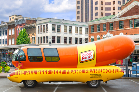
The hot dog brand updated its famous Weinermobile, which will now go by the Frankmobile, according to a news release. This is its first redesign since 1936 to highlight the new recipe for its all-beef hot dog products. New signage includes “The All Beef Beef Frank Frankmobile” to emphasize its natural ingredients as consumers increasingly avoid processed foods.
Wise
Food and beverage brands aren’t the only ones seeing branding shake-ups. Fintech company Wise launched a new look in 2023, with changes to its logo and online presence. The makeover centers on a bright green palette. Other changes include a stronger font, imagery and the use of universal symbols that speak to its global customer base.

Peloton
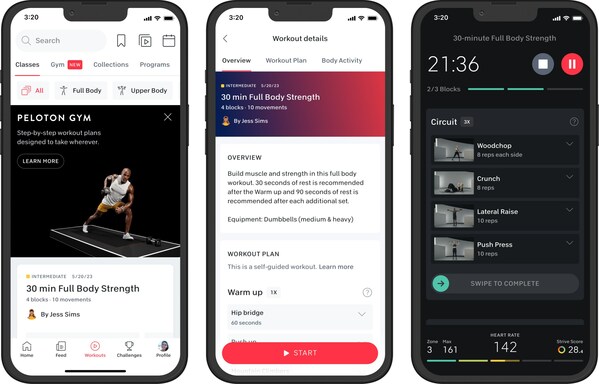
Redesigns aren’t just for anniversaries. Fitness tech company Peloton is using design to steer its brand toward more positivity after facing some controversy in recent years. Peloton’s brand refresh features a new color scheme that speaks to the feel-good emotions and afterglow of a vigorous workout. Its fresh online campaign and imagery meanwhile is meant to make the fitness brand more inclusive by speaking to people of all ages and levels.
Connecting companies with new audiences truly showcases the power of rebranding and intentional design. How will your web redesigns speak to your target customer?